
Northnano | ui8.net
Wine What?
The world of wine is vast and deep, and often very hard to understand. The diverse and unique characteristics of the wine world tend to make it inaccessible, and too often those with the knowledge like to be left on a pedestal. With Wine Wizard we’re aiming to eliminate that gap, and bring the world of wine within arms reach for everyone to enjoy.
Timeline
10 Weeks - Aug 2020 to Oct 2020
Role
UX Designer
Client
BrainStation
Tools
Sketch, InVision, Adobe Photoshop, Marvel PoP, MagicMirror, Angle, Zoom, Google Meets.
How it started…
I was tasked to identify a human-centered problem which warrants readiness for digital intervention. I examined the wine industry, specifically that of the casual wine drinker. This group often perceives that they are not ‘fancy’ enough to appreciate wine, and that there are no resources that are easily accessible.
Whether it be to demystify the wine world, or to empower those wanting to learn, the problem identified is to make the world of wine more accessible to the casual wine drinker.
The process.
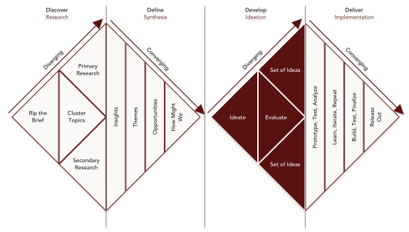
To visualize my design process, I leaned heavily on the British Design Council’s Design Double Diamond model, as shown in the next section. The first diamond being best described as, designing the right thing, and the second as, designing things right.

Discover

What’s the problem?
4 of 5 casual wine drinkers aren’t comfortable with the wine world’s vocabulary and find they have a lack of understanding of regions, varietals and vintages.
The casual wine drinker is directly affected by this, although you can consider retailers and suppliers being affected by not being able to move product since most casual wine drinkers stick to what they know.
What’s the fix?
Next I stated a hypothesis of what my solution could be and how it would affect my target user, and in turn how I could measure it’s success.
I believe that providing the casual wine drinker with an accessible and efficient way to learn the basic aspects of wine will empower them to order, purchase, taste and discuss wine with confidence.
I will know this to be true when I see the casual wine drinker deviate from their norm in wine ordering and purchasing.
Asking the right question.
With this problem space and area of opportunity appropriately defined, I created a question which would act as a guiding light throughout this design process.
How might we empower the casual wine drinker to understand how to taste and talk about wine, in order to better appreciate the diversity of wine?
Search, Re-search and Research
Here I cast a wide net within my problem space and executed multiple forms of research to affirm my problem and my hypothesis.

Define

What did we uncork?
From the quantitative and qualitative data from my research, I’ve reaffirmed my problem space and hypothesis. To summarize my findings, I created two personas which will act as my primary and secondary user.
You can find the full detailed report here.
Take a step in her shoes.
I took a closer look at my Celeste’s experience of buying wine by creating an experience map. With visualizing her full experience, we can better examine where and when her frustrations occur.
As evident in both Celeste’s journey and Amir’s quote, both my personas have interest in expanding their knowledge. Wether it be inconvenience of finding a reliable and accessible resource, or by being intimidated or confused by the depth of content, an opportunity for design intervention has presented itself.
Seize the day.
There were two clear opportunities I identified. The former is providing a solution for a surface level problem, essentially addressing a symptom. The latter, which I prioritized, was providing a route for individuals to find their own answers, the intention of course being to address the root problem.

Develop
Celeste and her stories.
I created several user stories from the perspective of Celeste, my primary persona. These stories suggest possible digital functionalities and are categorized into epics.


I took the most compelling story, which is highlighted above, that could represents the core value proposition and created a potential digital taskflow. Here you can see how this single taskflow has potential to provide functionality for several of Celeste’s stories.
Inspiring moods in vision.
The next steps required setting up my creative space mentally, by creating an inspiration and mood board that would help guide me through the next several steps. I used InVision to accomplish this and that board, in its entirety can be found here.

It all began with a pen.
As I began ideating on how on-screen interactions and taskflows would occur, I used my trusty Moleskine notebook and my favourite set of pens to sketch out a few digital screens. I took my best sketch and quickly iterated a lo-fidelity digital wireframe designed for iOS. I considered Apple’s Human Interface Guidelines to gain a more practical understanding of some of Apple’s system standards.


Deliver

Test, rinse, repeat.
With our initial wireframes for the primary taskflow complete, I used InVision to build a prototype. I moved into user testing with 5 different users with a strict script and set of tasks to identify any areas for design improvements. I went through 2 rounds of testing with different test users and applied any and all design improvements between rounds. A detailed report of the entire process can be found here.


Time to get pretty.
Now with my prototype in good shape, it was time to define my visual identity and inject some colour, branding and other hi-fidelity elements. How was I going to find the inspiration and moods to bring my app to life? Yes, you guessed it… I updated and refined my InVision board, which you can revisit here.
Accessibility.
As I began implementing my hi-fidelity elements into the wireframes, I wanted to keep accessibility in the forefront of my designs. I considered WCAG (Web Content Accessibility Guidelines) to keep Wine Wizard as accessible as possible.

Who is this wizard?
As I continued defining Wine Wizard’s visual identity, I had to hone in on specific brand name, brand colours, a wordmark and a logo. This entire process was painstakingly documented and can be found here (along with a detailed UI library which utilizes Frost’s Atomic Design analogy).

I diverged from the intuitive deep red tones to differentiate Wine Wizard from the current market of wine apps. I turned to green, representing white wine, for the brand colours.
I relied on these soft tones to portray an inclusive, approachable and accessible mood, so that users like Celeste would feel more comfortable.

I began ideating a wordmark by using different weights, sizings and styles. I continued to use Avenir as the main typeface because of it’s clean appearance, which would deliver an inclusive tone.
For the app icon, I iterated through variations of a wizard image. I opted for the most simple and minimal option and added a discrete gradient to imply a sense of depth.

My process for ideating the logo had the same principles in simplicity, minimalism and inclusion. I iterated a few options by simply combining my wordmark, icon and brand colours. The familiarity across all elements will help with usability.

Makeover complete.
Wine Wizard Prototype v3
It should be noted that as far as I’ve come in this process, Wine Wizard is still very far from being complete. The MVP (minimal viable product) is in fact there, but we should always be striving for more than minimal (other than aesthetic).
All other functions and tasks must be put through testing and appropriately improved, monetization opportunities need to be refined, and several glasses of wine need to be drank.
Considering the timeline, the state of Wine Wizard isn’t half bad. I’ll try my best to keep that glass half full.
Multi Platform Adaptation
I began to ideate alternative platforms where Wine Wizard could be utilized. I immediately imagined a kiosk touchscreen display in the liqour store that would help guide customers in their purchases.
Using Celeste, my primary persona, I created a storyboard which touches on her frustrations at the liquor store shown in her experience map.
Iterations of the kiosk adaptation focused on providing information, and discluded the favouriting and scanning features.
I maintained consistency with the mobile app to reduce any usability issues for users who would be familiar with the mobile product.

Marketing Website
Oh the process.
Even though I have most of the elements I need to push forward to make this responsive website, the interactions and layouts for a webpage are vastly different from a mobile app. So I began with searching and compiling inspiration using InVision which can be found here.
I followed suit with the process i’ve documented above and ideated with pen and paper, quickly iterated a lo/mid-fidelity wireframe and worked in my branding to create a hi-fidelity prototype. I created three versions to accomodate responsiveness for the viewports of desktop, tablet and mobile. This process, as you’d expect, is documented and can be found here.

Design Impact & Future Thinking
Food for thought.
All sarcasm and jokes aside, I do imagine the true impact of my designs effecting the way the average wine consumer would appreciate wine. As I sip on my glass Rhône, I realize that wine knowledge isn’t a priority for most. From conversations i’ve had with many friends, peers and patrons, it’s not as if the world of wine is doing itself any favours. The subjectivity and arrogance of “wine people” make the pursuit of wine knowledge inaccessible and frankly, unattractive. I hope that the narrative can change, and from my perspective, a tool like Wine Wizard can give an individual the tools to begin to understand the complexities of the world of wine.
Wine is meant to be understood and enjoyed by all, and that’s the ultimate impact that Wine Wizard could hope for.
Look into the crystal ball.
Looking into the future, and the possible implications of our actions we take today is always interesting. I used the Tarot Cards of Tech to provide a few prompts to get my imagination rolling.

I believe the topic of wine is inherently elite and often times when an individual gains status in such a topic above others, they’ll typically make sure everyone knows it. Essentially what i’m saying is they would become a wine snob, exactly what i’m intending to eliminate… and/or alcoholism is always a concern.

This product essentially is engaging by providing a sense of education. One of the primary aspects of wine is to taste it, and form your own opinions and this is best practiced with friends or family. So the hopes of promoting disconnect is when the user shares a bottle of wine with a friend and forgets to check their phone for hours.

The only feature I can imagine that’s pushy is the potential for advertisements with the app itself. It would suggest a wine to try, but that’s as far as I can imagine at the moment… and even if it’s an ad, the wine may still be worth trying.

The obvious is for recovering alcoholics, and during any sort of addiction meeting. A more social situation could be when at a restaurant or a vineyard and fact-checking your server. No one likes a know it all… plus, wine’s subjective. I heard somewhere that we should be embracing ambiguity.

“Wine Wizard promotes alcoholism”
Yeah, that would not be great. Please drink responsibly everyone. Otherwise maybe something along the lines of being a pawn for a big conglomerate wine company… but that would have been a deal with the devil we would have signed.
I suppose that the narrative of all the information found within the app could be controlled by a corporation looking to steal data and guide consumer behaviours for their own benefit.
That’s not a very original concern though i’d say…
Not to beat a dead horse but, alcoholics. Not that alcoholics need a reason or motivation to buy wine, but this may give them a rationalization of education or self-growth to reinforce their destructive habit. Otherwise if it did become popular, it could influence the wine market and alter global wine economics.
It’s entirely possible that with the intent of empowering the casual wine drinker by providing foundational knowledge, it could do the opposite. It could discourage and mitigate users from becoming more comfortable and expressive with wine. This by no means is through functionality, rather the psychology of copy and delivery.
Cessation
10 weeks later
Looking back at the past few months, i’ve learned an incredible amount. Here are a few of the concepts that stood out to me the most during this project.
Design is forever a work in progress.
Even when a product is released, the research, ideation and iterations do not halt. The world of technology is ever changing, as are people and their needs. This will only create more and more areas of design opportunity.Every choice should be made deliberately.
From ideating techniques, to research methods, to design decisions and even to the type of coffee I drink and the layout of my workspace. Every decision in the design process should be made with purpose and with reason. There is no, “I don’t know why I designed it like that”.Fresh eyes and different eyes.
This is a reminder that mental fatigue is very real, and can occur more often than we’d like. This also refers to the concept of not working in a silo. Teamwork and collaboration is one of the most important attributes to a good design.Don’t fear change.
It seems as it’s only a matter of time until a change in direction will be made within the design process. As we pivot, we should be ensuring that they are research driven decisions and we should be leaning into them. It’s also important to remember what we’ve done in the past and to keep version control (in case we take a wrong turn).Refer back to our guiding light.
There were times when I would lose track of the true purpose of the product. Which appears to be easy to do when one gets deep into a design project. Keep that How Might We at the top of your workspace, and refer back to it to remember exactly what it is we are designing for.Don’t design for the designer.
As creatives it’s expected that we have some pride. It’s important to remember that no matter how great of an idea I may have, if it’s not applicable to my users then it may not be a great idea.
“Have strong opinions, and hold them loosely” - Jason Mante, Google Area 120
“One of the best qualities a UXd can have is to be able to listen first.” - Andrea Reck, Scotiabank
“Embrace ambiguity.” - Joel MacLeod, BrainStation
Any questions or comments please don’t hesitate to contact me.