KaylaFerreira.org Redesign

Timeline
2 Weeks
Jan 5, 2021 - Jan 19, 2021
Role
UX Designer
Client
Kayla Ferreira
Tools
Sketch, InVision
Adobe Photoshop,
SquareSpace
Mission: A SquareSpace Redesign
Kayla Ferreira is a fine artist based out of Toronto, Canada. She has been using SquareSpace to host and build her website, and built the first iteration of this site herself.
She is seeking a redesign with more usability in mind, and in conjunction with a new social media marketing push, she hopes to drive more traffic to her website and increase her sales.
I recommended a redesign within SquareSpace so that she can maintain and update the site as required independently. She can also utilize SquareSpace analytics to measure the success of the redesign.
Client Goals
• Look professional.
• Showcase body of work.
• Increase traffic.
Constraints
• Must use SquareSpace.
• Work to be organized by year.
• Minimalistic design.
• Maintain same color scheme.
• Use similar font styles.
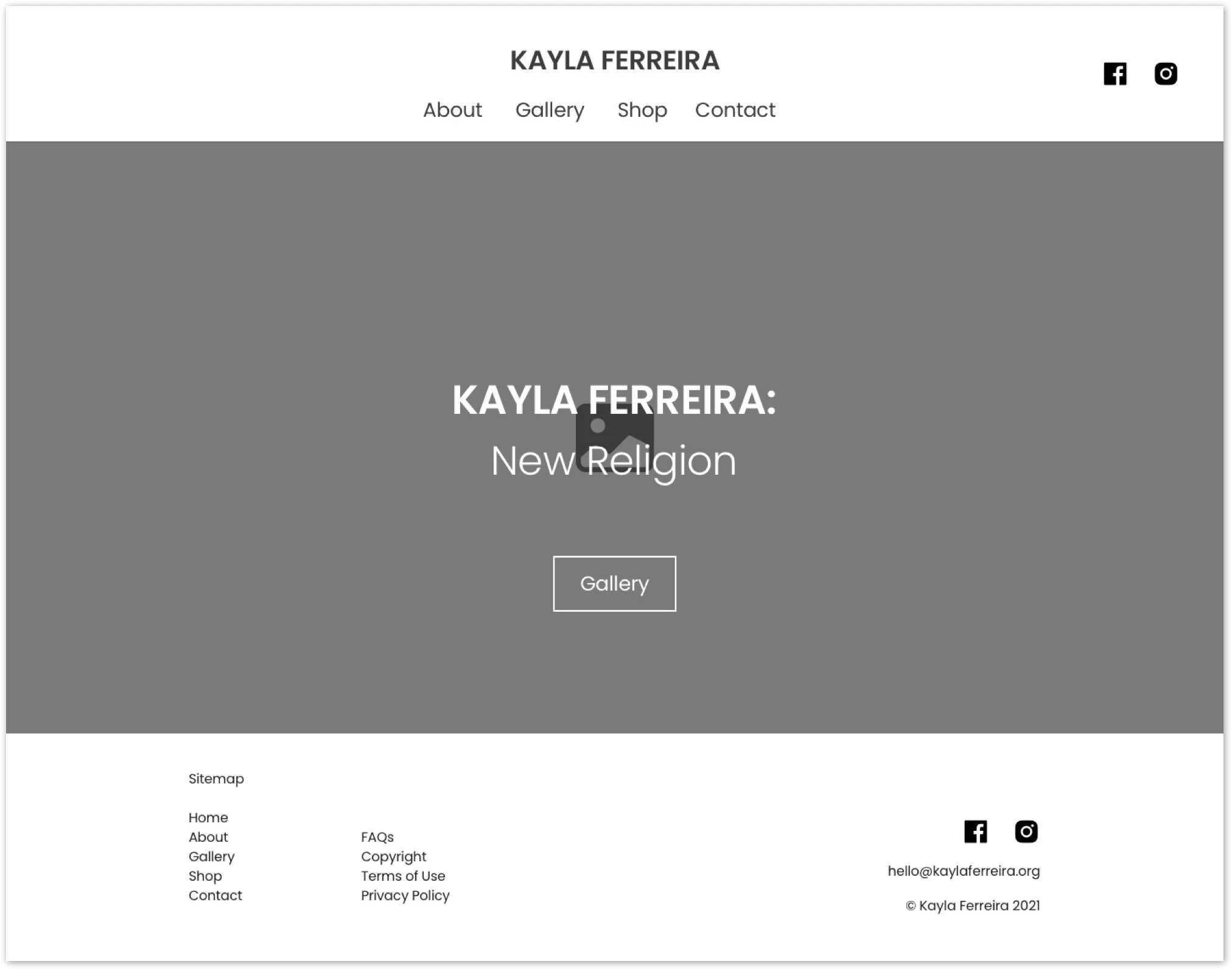
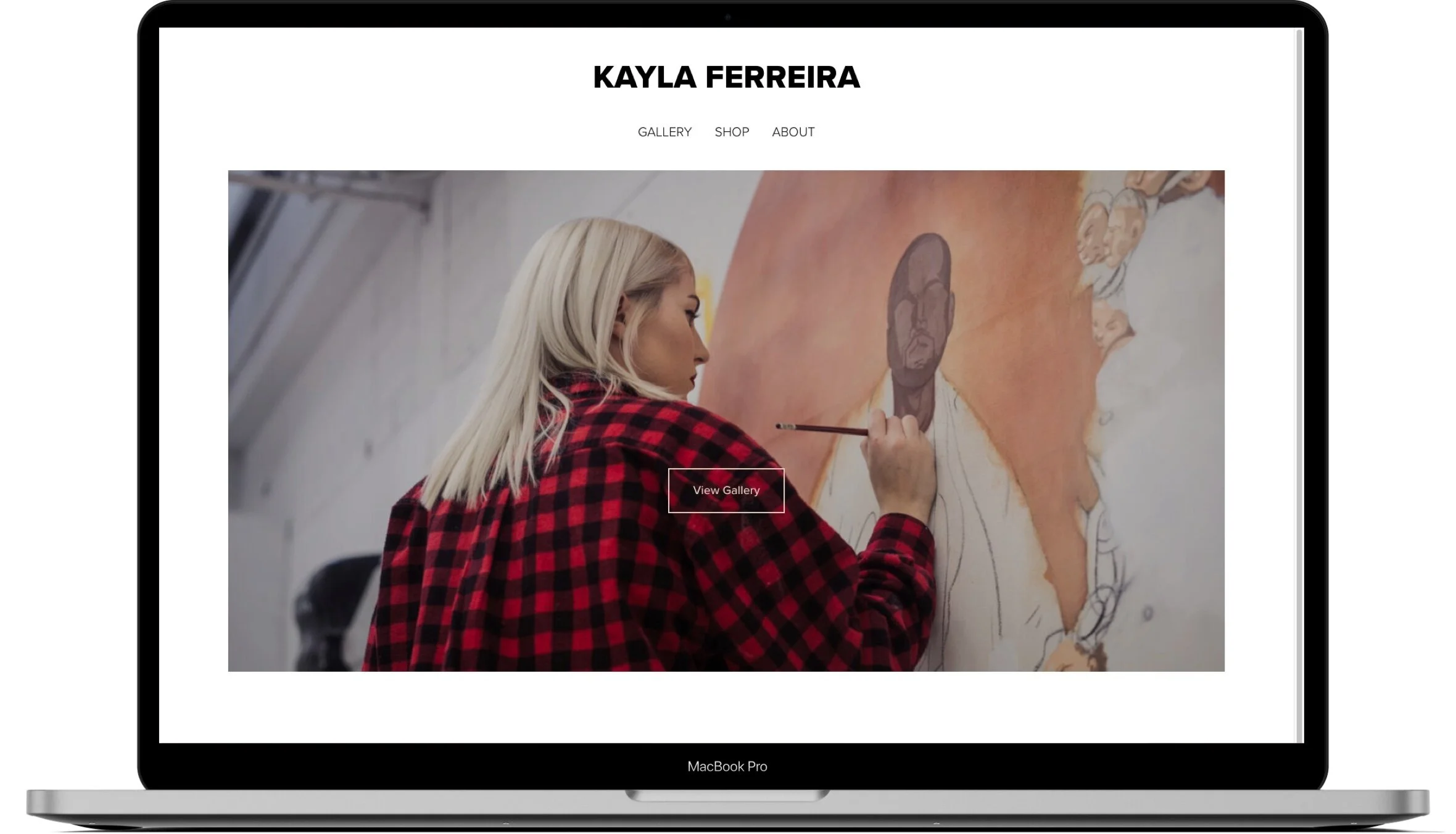
Original Design
The Process


Define
Ideate
Prototype
Test
Website Analysis

Affordances & Signifiers
Problem
• No clear indication on gallery functionality.
• Prev/Next CTA’s are hidden in the bottom left.
• Cursor changes into an arrow but can be hard to notice.
Solution
• Create more discernible affordances & signifiers.
• Alternatively, change format of the gallery.

Accessibility
Problem
• Font size appears small.
Solution
• Use a minimum of 16px and 1.5x line height as suggested in WCAG 2.1
The Question
How might we improve Kayla’s website so that user’s can easily
navigate through her gallery and shop in order to improve sales?
Inspiration References
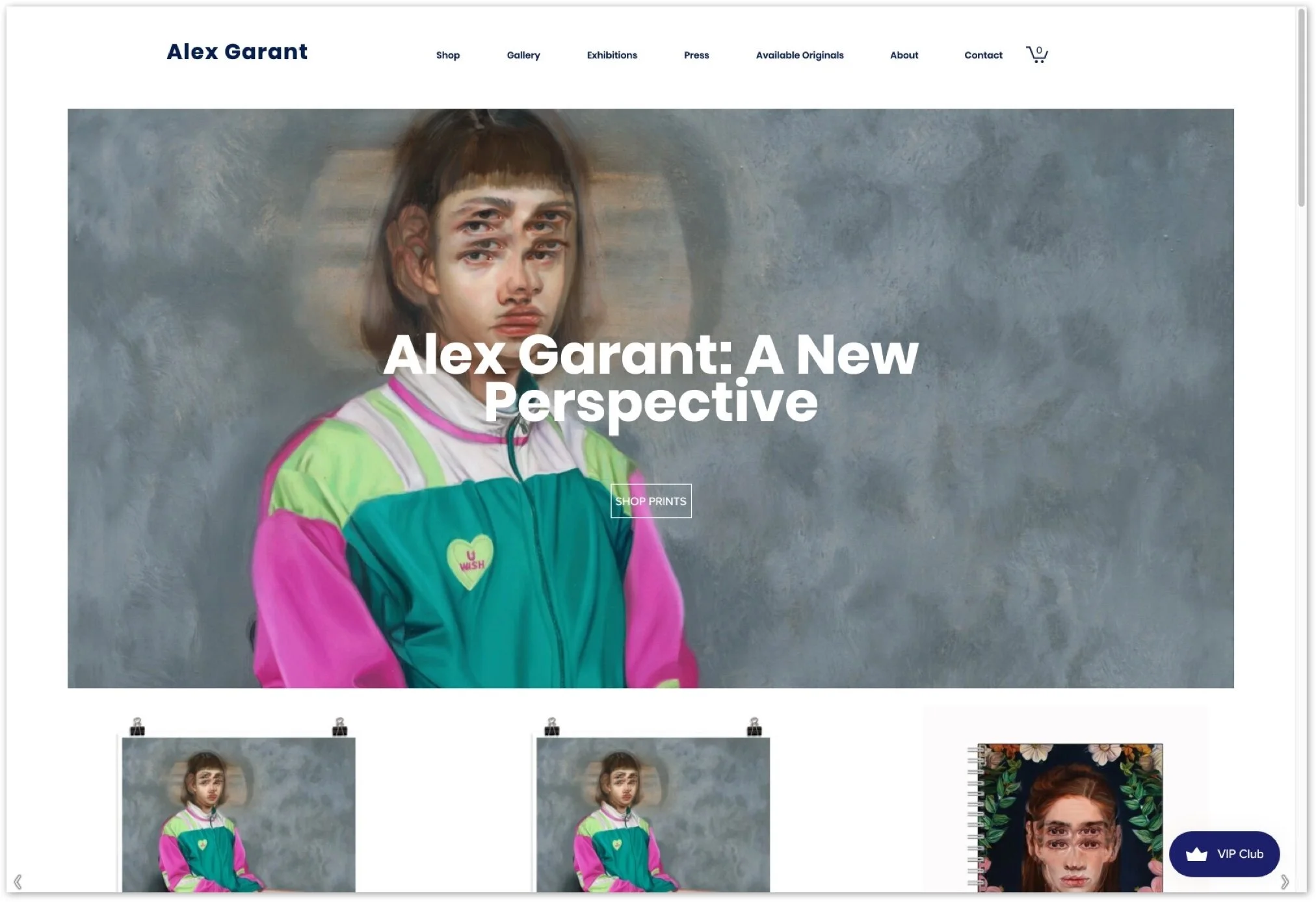
Alex Garant
Client Likes
• Hero image.
• Shop display.
• Nav bar.
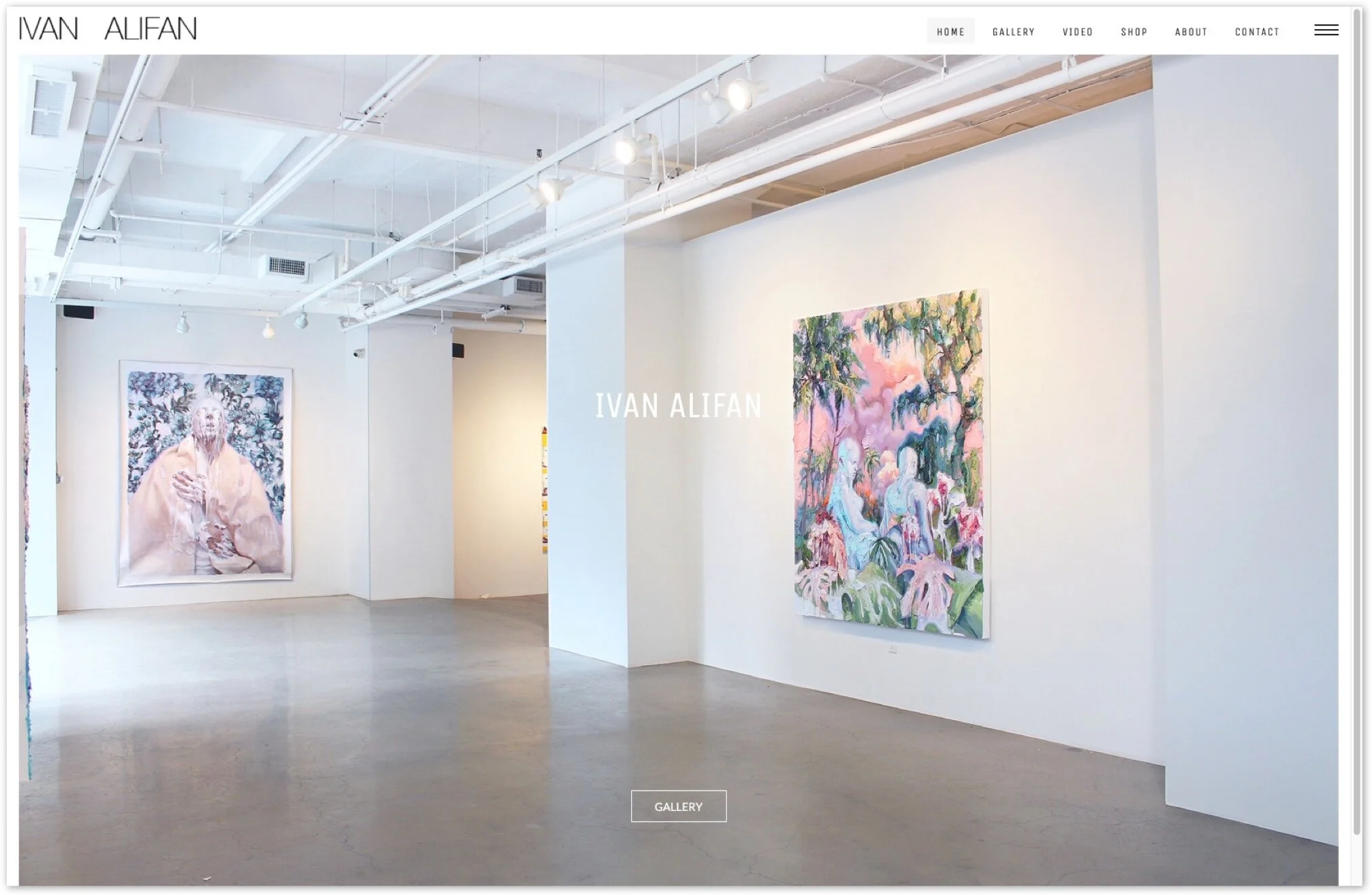
Ivan Alifan
Client Likes
• Hero image.
• Info overlay on works.
• Shop image gallery.
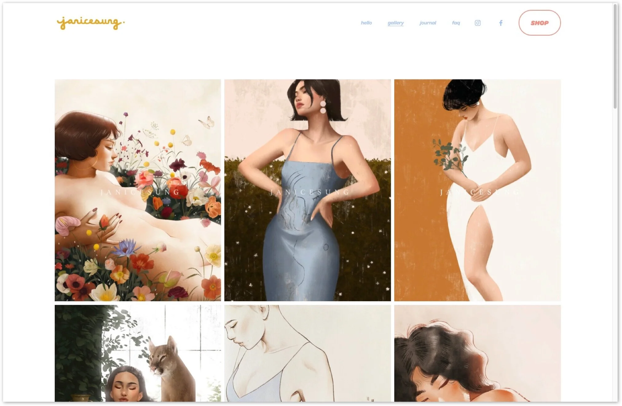
Janice Sung
Client Likes
• Gallery.
• About page.
Ideastorming
I started brainstorming and laid out all my ideas on a virtual whiteboard in a Sketch file, and continued to add and subtract to it as the project demanded.
I then began sketching out ideas in my trusty notebook to get a better understanding of these ideas in context.
Lo-Fidelity Wireframing
I delivered lo-fidelity wireframes to the Client for review.
Immediate notes received:
• Prefer no title for work (ie. New Religion).
• Centred footer, dislikes sitemap.
I applied the Client’s requests and completed wireframes for the remaining pages and sent them off for review.
I reassessed our goals and considering the Client’s stage in her career I suggested we focus more on showcasing he work, opposed to promoting sales.
Home Lo-Fi v1
The Client had a preference to the font style she had in her previous design. The font used was Proxima Nova, so I utilized that font with a base size of 16px and a line height of 1.5 times the font size. The font hierarchies I used in the designs are as follows.
Headers - Weight 400
H1 - 4rem
H2 - 2.8rem
H3 - 2.2rem
H4 - 1.6rem
Body - Weight 300
B1 - 1.5rem
B2 - 1.2rem
B3 - 1rem
Buttons - Weight 500
1rem
Home v2 LoFi
About v1 LoFi
Gallery v1 LoFi
Shop v1 LoFi
Product v1 LoFi
Reframe the Question
How might we improve Kayla’s art gallery so that her users have
a streamlined experience in order to understand the scope of her work?
Hi-Fi Wireframing
These designs were all approved! Next was to see it in context via hi-fidelity.
Home v1 HiFi
About v1 HiFi
Gallery v1 HiFi
Shop v1 HiFi
Product v1 HiFi
To stay true to the minimalistic and simple approach of the website, I also designed the buttons inspired by Material Design’s magnetic button design.
Keeping the Constraints in Mind
I designed with the SquareSpace platform constraints in mind. This includes the functionality of the SquareSpace eCommerce platform and the arrangement of how the shop and product pages interact. I broke from some of the rigid structure to benefit my designs using custom CSS and other code injection where I found it necessary.
The platform also automatically constructs the responsive design to tablet and mobile, which I checked continuously throughout the construction of this website to maintain a mobile first mentality.
I decided to streamline my workflow by building a prototype directly in SquareSpace. This process helped in identifying the platform constraints early, and this way I could easily send and update this “prototype” to the Client.

User Testing
With a prototype built in SquareSpace I pushed it into user testing, using 5 unique users with a set of 5 tasks. I used Google Meets and got them to share their screen and coached them to think out loud as much as possible. The full user testing report can be found here.
Tasks
1. Let’s explore Kayla’s work/art
-Can we find the title and dimensions/materials for each piece?
-Can you find her piece from 2018 named Yonce?
2. Let’s learn more about the artist.
-How can we contact her?
-Let’s find her social media.
3. Let’s locate her shop and learn more about the item “Ferreira Diptych”.
-Let’s add it to the cart.
-Return to the gallery page, and return to your cart.
-Remove the said print from your cart.
4. Let’s find her return policy.
5. Let’s return to the home page.
Design Improvements
-Remove copy on hero image.
-Add an independent refund policy page.
-Move the location of the shopping cart to the top right (as per my design but SquareSpace had different ideas).
Handoff
With the redesigns in place and the final designs approved by the Client, this website was ready for handoff. As the website was already built there was no need for a complicated handoff to a development team, rather an ownership handoff through SquareSpace.
This went seamlessly and the Client has kept me on the account as an editor, for if and when any issues arise. I gave a small orientation to my Client with how to add and edit the content of the website, and told her I would remain reachable if any questions arise!
You can find the current iteration of this site at kaylaferreira.org
Future Considerations and Retrospective
If it isn’t broken, don’t fix it.
• Client was using SquareSpace and was comfortable with the platform, so let’s stick with said platform.
• Using this service provides autonomy for the client, so no late night calls to a developer.
• SquareSpace provides easy SEO, eCommerce and analytics (where we can hope to measure the success of the designs).
Breaking free from the templates.
• Using custom CSS we were able to break away from the typical templates, as to give some uniqueness and character to Kayla’s website.
Small budget
• Using SquareSpace we bypassed the need for a developer (and the costs associated with them).
• One time cost for design, and an annual subscription to SquareSpace is the total expense.
As client’s needs change, so will the project’s.
• For now SquareSpace is sufficient for Kayla.
• If and when the client’s needs exceed SquareSpace’s capabilities, then we’ll cross that bridge then.
Gallery Style will evolve with the Client
• For now the scrolling gallery works, but as Kayla keeps creating more work the gallery style will have to accommodate.
• A great example of an evolved version of this gallery is Ivan Alifan’s gallery.
A great website isn’t enough
• A gentle reminder to the client that an effective and efficient social media marketing strategy, and networking is what will help drive traffic.
• Including a more diverse inventory in her shop will also help drive sales.
Expect improvements and continue to iterate.
• Where this website was when we put it online upon delivery is just a stepping stone, as digital products should continue to evolve and grow alongside the client.
Any questions or comments please don’t hesitate to contact me.